Ulysses 20 Brings a Grammar Style Checker and a New Dashboard
If there’s one app that has pulled off the move to subscription-pricing, it’s Ulysses. Ulysses has done this by keeping all the promises it made when making the switch. Ulysses said that the new pricing system allows the developers to release new features constantly and not hoard them for a big release. And the app has been doing the same. Just a few months back, the company released Ulysses 19 with features such as Material Sheets, Markdown Keywords, and more. And now, the Ulysses 20 update is bringing a host of new features that include a grammar style checker and a powerful new Dashboard.
Ulysses 20 is one of the biggest updates that the company has released in a while and it will change the way you use this excellent writing app. Here’s a breakdown of all the new features:
Grammar and Style Checker
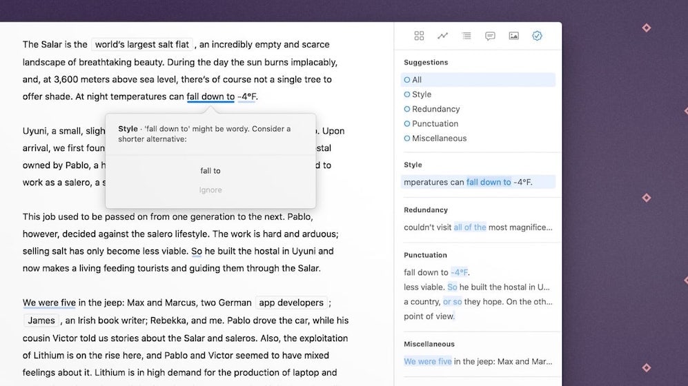
For me, the headlining feature of Ulysses 20 is the new built-in grammar style checker. Most of us use grammar style checking services (Grammarly is the most popular one) for improving our writing. However, using such services is quite cumbersome. You have to first get your text out of Ulysses, import them into your grammar service of choice, and then get it back again into Ulysses. It involves a lot of steps and there are always some formatting or link-loss issues that I have experienced.
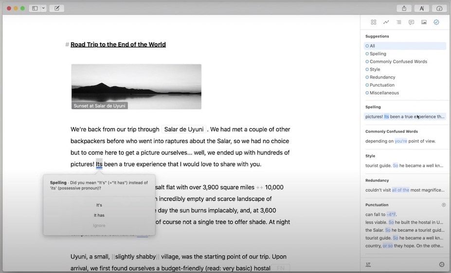
With the new built-in grammar checker, you don’t have to do anything. Now Ulysses itself will analyze your writing using its comprehensive grammar style check tools. Ulysses can analyze texts and provides informed suggestions in categories such as capitalization, punctuation, semantics, redundancy, typography, and style.
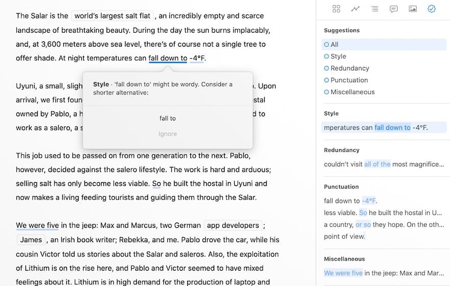
The best part is that unlike other grammar services that mostly only work with English, Ulysses’ grammar checking service will work with 20 languages. It’s worth pointing out that Ulysses has not developed its grammar checking service. Rather, it’s using an already established style checking service called LanguageTool Plus.
I had never heard of this service before and I have not spent enough time on Ulysses after the update to give you a judgment on its performance. I can say that it easily catches all simple mistakes and does a good job of proof-reading your writing. I will do a comparison of Ulysses grammar style check with Grammarly in a future article (probably next week), so keep an eye out for that if you are interested.
The final point to note here is that the grammar and style check is available only on the Mac app right now. The developers have promised that are planning to add the feature to the app’s iPad and iPhone version in another release this fall.
The New Dashboard
Ulysses 20 is also introducing an all-new Dashboard that gives you access to all the information that is relevant to your text. In the dashboard, you get several views. In the past versions of Ulysses, you clicked on the attachment icon to open the attachments panel. Now, that is replaced with the Dashboard icon (which is the same as the past statistics icon). Clicking on the icon will reveal multiple views. Here are all the views in the dashboard:
We will start with the second icon which is the progress view. We will come back to the first view at the last as it is the collection of all the views.
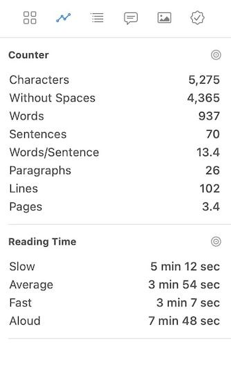
1. Progress View
The progress view is an upgraded version of the statistics view of the past. It’s all about the numbers and shows you counts for words, characters, sentences, paragraphs, along with the reading time. You can also check statistics for a part of your document by highlight the text. This is also where you will attach a goal to your document.
2. The Outline View
The outline view has also become more powerful. Now apparat from showing you headings like before, it also indents the sub-headings so you better understand the structure. You can click on any heading in the outline view to jump to that heading in the document.
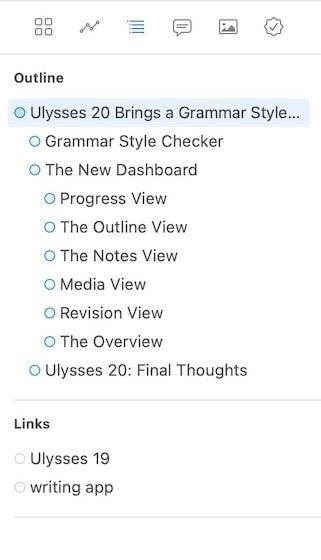
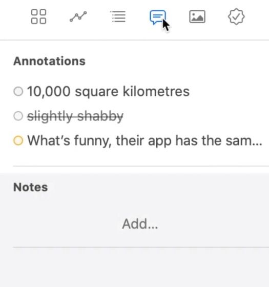
Not only that, but the outline view now also shows annotations, links, and footnotes. Annotations include comments, marked passages, and deletions. You can also access your annotations using the Notes view.
3. The Notes View
The Notes view is the same as before. Here, you can add notes to documents that you don’t want to show up in the main write-up. As mentioned, apart from notes, it also shows the annotations.
4. Media View
The Media view is also getting new features. Now, not only it stores the images you want to keep for reference but it also shows all the media that you have attached inside the document. And just like the outline view, you can click on the media name to jump to its place in the document. You can also double click on a media file to open it for editing.

5. Revision View
This is the view where you can access the new grammar and style checker service of Ulysses. Click on the “Check Text” button to get suggestions for spelling, style, commonly confused words, punctuation, and more.
0. The Overview
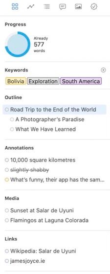
The overview is the first view that we skipped at the start. As I said, it gives you a compact view of all the views (minus the revision view) that we have discussed until now. You can click on the arrow buttons to collapse a view of click on the settings icon to remove a view from the overview.
Ulysses 20: Final Thoughts
Ulysses 20 is an excellent update and takes the writing app to a new level. If the grammar and style checker service works well, then very few app will be able to compete with Ulysses as a packaged writing solution. I will keep testing the app and share my thoughts on all the new features in a future article. Do let me know how you feel about this new update in the comments below.
Visit Ulysses Website ($5.99/month or $49.99/year)


Comments ()