Ulysses 15 Brings Editor Split View, Remote Image Support, Keywords Management and More

Justifying a subscription-based pricing system is difficult. But, if there’s an app that has pulled it off successfully, it’s Ulysses. A subscription-based pricing system frees the developers from the obligation of conducting a major release every few years. That’s exactly what Ulysses has done. Since the app has moved to a subscription-based pricing system, they have introduced a ton of new features regularly. Just last year with Ulysses 13, the devs introduced a bunch of new features including new deadline and daily goals, support for colored keywords, improved syntax highlighting and more.
Ulysses 14 which was a minor update and introduced a revamp dark mode, support for Siri Shortcuts, some design improvements, and more followed it. Now, the devs are back again with the new Ulysses 15 update which is bringing a host of new improvements. Here is everything new with the new Ulysses 15 update:
Ulysses 15 New Features
Split View Support
Our work is not always linear and sometimes it requires us to work on two different documents. Maybe you want to reference a document as research or just making edits to a document and jotting down notes, or translating a document in a different language, having two documents side by side can make your life so much easier. You can do this by opening two windows of Ulysses and then using macOS’s split-screen view mode. But that is cumbersome and Ulysses 15 solves it by bringing native split view support in the app itself.
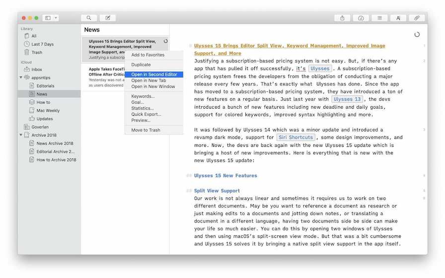
My favorite thing about this split view is that it allows me to split screen not just vertically but horizontally too. It highlights the window that you are working on so you always know where you are working. You can switch between the two editors by using simple keyboard shortcuts. There are three ways start split view in Ulysses 15. The first method is to right click on a sheet and then select the split view option. You can also use the “View” menu of the app and select the split view. The easiest way to do is to use its the ⌘⌥3 keyboard shortcut which both enables and disables the split view
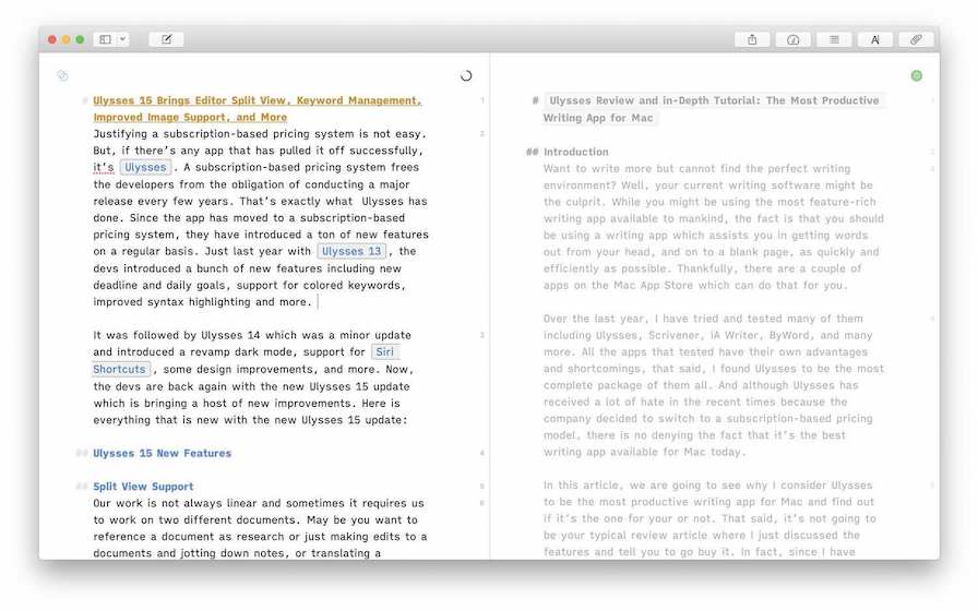
When you start split view in Ulysses, an intersecting circle icon appears on the active editor. You can click on this icon change the split view from vertical to horizontal, close the split view, and more. Switching between the sheets is easy too and can be done using the ⌘⌥→ and ⌘⌥← keyboard shortcuts. Ulysses lets you adjust the window size to any scale which is nice. One neat feature in Ulysses’s split view is that you can scroll through both the documents at once by holding the ⌥(option) key. This is a nifty feature which will save users time they would have spent switching between the documents just for scrolling.

Keywords Enhancement: Search and Management
Ulysses introduced colored keywords with its version 13 update and the new version 15 updates build upon that. Now, not only you can search for sheets by keywords but also by different keyword colors and groups. This adds a new paradigm to how you can organize your sheets across projects. It will be fun to test out this new feature and I will write more about its usage once I have thoroughly used it. Apart from this, Ulysses 15 also brings a keywords management tools which allows you to display and edit all the keywords in one spot. You can change keywords’ colors, rename them, merge them or delete them. To access the keyword management UI, right click on a keyword and then choose the “Manage Keywords” option.
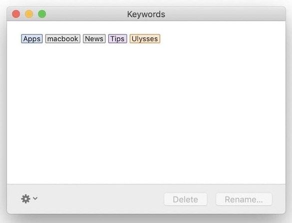
Image Support Improvements
One of the biggest improvements coming with Ulysses 15 is coming to the way it handles images. Being a markdown editor, it’s hard to find a line which keeps the editor easy to use and still doesn’t let you miss out on features that you might need. Ulysses has always done a great job of defining that line and the same is true with Ulysses 15. With the version 15 update, While it has improved how the app handles images, it has kept its editor clean and distraction-free which is the USP of a markdown editor.
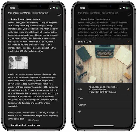
Coming to the new features, Ulysses 15 now not only lets you import offline images but also online images saved in the cloud. Previously, online images appeared as image tags but now Ulysses will show a preview of those images. The preview is synced on all devices so you don’t have to worry about missing it on your iPhone or iPad. Not only that, when exporting a document in PDF and DOCX formats, it will export all the online images along with the text and you no longer have to download and insert the images separately. Ulysses now also supports resizing of images. It means that you can resize the images before exporting in the editor itself.
Dark Mode for Export Preview
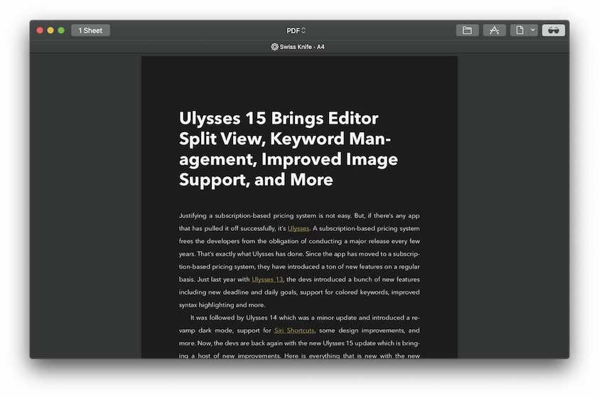
Ulysses has offered some kind of dark mode from the beginning which improved with the introduction of Ulysses 14. However, one part of Ulysses never embraced the dark side which was the export preview window. With Ulysses 15, not the export preview window also supports dark mode. So, you won’t be blinded when you are reading and exporting your next blog post in the middle of the night. You can switch between the dark and light preview by clicking on the sunglasses icon at the top right.
Other Changes
Apart from these big features, Ulysses 15 is also bringing several minor improvements and bug fixes. For starters, now the app supports exporting to WordPress 5.0 “Gutenberg”. Now, empty links, images, and footnotes are now greyed out in the editor and empty sheets are erased immediately when moved to the trash. On iPad Pro 12.9-inch, now you can work on Ulysses in split screen mode while having the sheets panel open. Goal History has improved and now shows you the full history of your daily goals. You can check out the list of these improvements and bug fixes by visiting the Mac App Store and reading the release notes or you can read them down below:
Fixes
- Fixed import of PDF files using Share Extension.
- Fixed export preview when changing order of glued sheets.
- Fixed handling of umlauts and other characters in URLs.
- Fixed crash when editing a goal.
- Fixed crash when editing text with smart tags.
- Fixed crash when typing Tcl code in code blocks.
- Fixed crash in Share Extension when importing large images.
- Fixed resizing of the navigation panel.
- HEIC files are now converted to JPEG during export.
- Focus is immediately set to search bar when using ⌘F (command-F).
Get Ulysses: Free Trial, $39.99/year
Get Ulysses on SetApp Subscription!
Ulysses 15: Final Thoughts
Ulysses 15 is a good update to the writing app. The split screen view and improved support for images will help writers a lot in their research and writing process. The new keywords features will help writers who work with long projects containing tens and hundreds of sheets and need more control over the organization and filtering process. I am happy with the new update but I would like to hear from our readers. Do you like the new features on Ulysses 15 or not? Let us know in the comments section below.


Comments ()