Things 3 Review: The Best To-Do List App for iPhone and Mac?
Things 3 brings great design, easy task input, robust organizational structure, great documentation and note taking abilities, and more.

I used to be the guy who didn’t believe in using a task management system. I always thought if a task is important I will eventually complete it. However, as I started juggling more and more things, I found that some of the tasks, although important, fell through the cracks as I completely forgot about them. Thus began my journey to find the perfect task management system, also known as to-do list managers. In my quest to find the perfect to-do list app for iPhone and Mac, I tested quite a few popular apps. At last, I settled down for Things 3 (Mac/iPhone) as I found the app to be the best to-do list app for iPhone and Mac for my usage scenario. In this article, I am going to share with you why I think Things 3 is the best task manager app for Mac and iPhone as I bring you Things 3 Review:
Note: I have used the words “to-do list app” and “task manager app” interchangeably in this article, as they both mean more or less the same to me.
What I Look for in A Good To-Do List App
When it comes to task management, everybody has different needs. Depending on the type of projects you are managing, you might prefer some features over the others. That being said, there are some core features that every task manager should get right, otherwise it will fail even before a single task is marked done inside the app. Here are some of the features that every to-do list app should get right:
1. Easy Input System
If there is one thing that a task manager or to-do list app should get right, it’s the task input system. I don’t want to spend even an extra second than what is needed to enter my tasks. The process should be as frictionless as possible.
2. Good Organizational Structure
A good task manager app should also bring a solid organizational structure. Whether a user wants to use one-off tasks or manage an entire project, the underlying structure should be present and work in either of the scenarios. As such folders, projects, and tags are not just important rather imperative to a good to-do list app.
3. Good Design and Aesthetics
While this might not seem to matter at first, if you are going to use something to manage your whole life, it better has a good and aesthetically pleasing design. The app should make you want to use it and not the other way around.
4. Task Documentation
This is the feature which most of the task-managers get wrong. Some tasks are complex and require you to have a little bit of context or documentation attached to them. At the least, individual tasks should support notes. It is better to have the related information in the task itself rather than saving it someplace else.
5. Views and Forecasts
A good to-do list app should support multiple views. You should not only be able to see due tasks based on a project but also based on date, tags, people, and more. At the very list, a today and a forecast view should be present.
Best To-Do List App for iPhone and Mac: Things 3
After testing a multitude of task manager apps including OmniFocus (Mac/iPhone), Todoist (Mac/iPhone), 2Do (Mac/iPhone), Wunderlist (Mac/iPhone), and more, I found Things 3 to be the best to-do list app for Mac for most users. Things 3 has become my favorite productivity app for Mac as it helps me get things done in the most efficient and non-intrusive manner. That doesn’t mean that the app is perfect, in fact, it has its fair share of shortcomings which we will get into later. For now, let’s find out why I love this app so much:
Design and Aesthetics
I have used many to-do list apps over the years and design was never the thing that stood out to me. Well, all that changed when I first started using Things 3. Things 3 is one of the best-designed apps on the App Store and I just don’t mean its looks. Of course, Things 3 looks beautiful, however, its design prowess goes far beyond that. From its animations to its use of color palettes to its strategically placed buttons, the app just flows from one thing to other. It looks like a blank sheet of paper which is ready to be filled with ideas swirling around in your head.
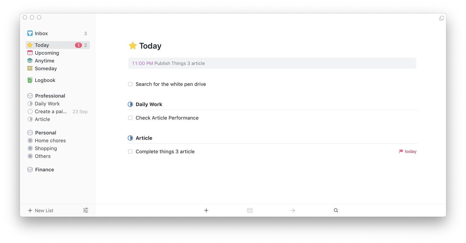
Things 3 brings an exquisite design which not only looks beautiful but is also highly functional.
I adore the animations on Things 3. Every interaction, whether you are using the cursor to click on Mac app or using your finger to tap on the iPhone app feels fluid and delightful. Things 3’s design also makes it easy to search for things. On the Mac app, you don’t have to find the search button. Just launch the app, start typing and the search window will automatically open. On the iPhone, you just pull down on the screen and start typing your query. The search function works no matter where you are inside the app.
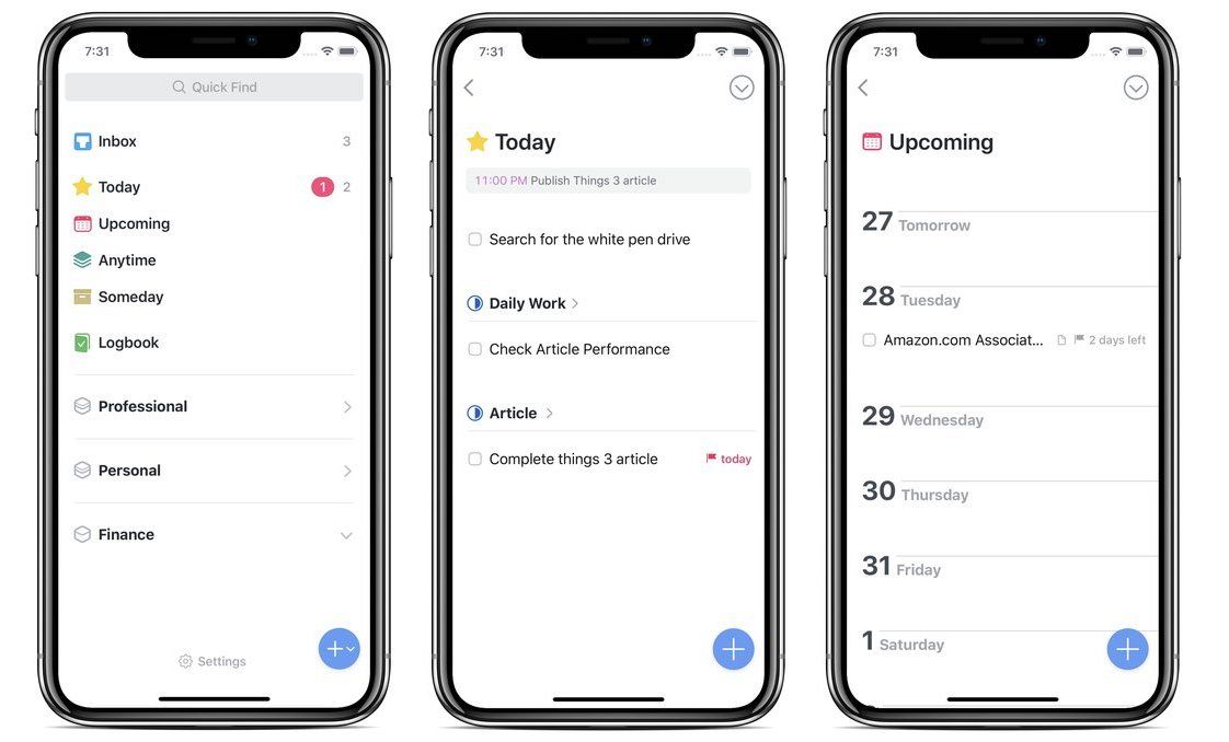
The design and aesthetics of Things 3 just blew me away. I love opening and interacting with the app. It has made me use the app more and now all my ideas and tasks find a place inside the app without fail. The only that I miss in the app is a dark mode. Things 3 is a jet of whiteness and I love it most of the time. However, a dark mode definitely comes in handy when you are working late into the night. I miss it even more since I installed the macOS Mojave beta. The dark mode on macOS Mojave is awesome and I do miss it while using Things 3.
A Walk Around of The Interface
On the surface, Things 3 is a simple app. There are a few fixed interface elements or menus while some others are more flexible. On the Mac, Things 3 has a tabbed view. The left panel houses all the menu items while the right side shows the elements that are hosted inside the menu. From top to bottom the side menus are Inbox, Today, Upcoming, Anytime, Someday, Logbook, and Trash. Do note that Trash only appears when you delete items. As you empty your trash, it dissolves from the view. Below these fixed menus are projects and areas that you create.

Logbook is a great place to revisit your completed tasks. It helps in reviewing your past while also giving a boost to your morale.
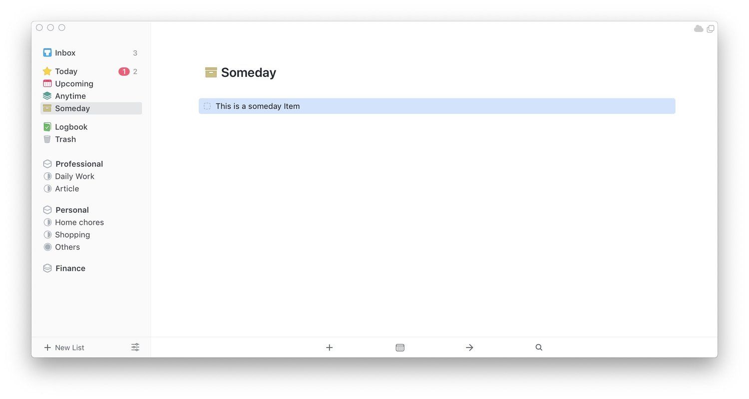
The side menus are pretty much self-explanatory. Inbox is the default dumping ground of your ideas. You can put anything and everything here which you can later sort into projects. The Today view shows all the tasks that are due, well, today. Similarly, the upcoming view shows tasks forecast for future while Anytime shows all your pending tasks. Someday is a special case for tasks which you want to get to but you don’t know when. The Logbook is one of my favorite features of Things 3 as it shows all the tasks that I have already completed. It is not only good for reviewing your past tasks but also for boosting morale. Seeing a list of completed tasks surely makes me feel good.
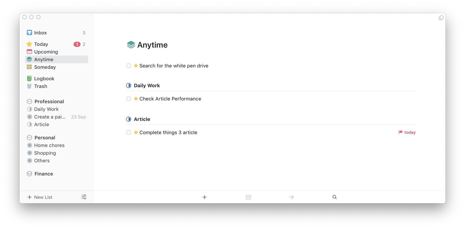
That is the entire fixed interface of Things 3. It’s so simple yet so useful and therein lies the power of Things 3. As you might have noticed I have not talked about projects and areas yet. It’s because we will learn more about them in the coming sections.
Inputting Tasks on Mac
As I mentioned above, one of the most important things that a task manager app should get right is the ability to easily add tasks. If you find it hard to enter your tasks and ideas into the system, you are not going to use the system itself. Thankfully, Things 3 makes it super easy to add tasks. Let us start with the Mac app first and then we will move onto the iOS app. On the Mac, there are a number of ways you can enter tasks. The most straightforward way to do it is by launching the app and hitting the ⌘N keyboard shortcut to start a new task. Alternatively, you can click on the ‘+’ button at the bottom of the app’s window to add a new task.
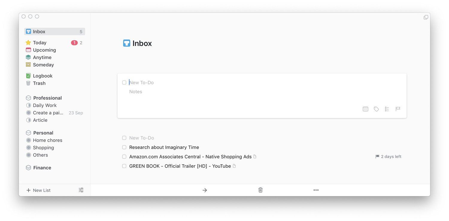
The Quick Entry panel of Things 3 works like magic. The ability to highlight text, links, or files and converting them into tasks never ceases to amaze me.
My favorite way to input tasks in Things 3 is by using its Quick Entry panel. Once you have set the feature, you can hit a customizable keyboard combo and a quick entry panel will open up. By default the keyboard shortcut is set to Ctrl + Space, however, I have changed mine to ⌥T. Whenever a task comes to my mind, no matter what I am doing or which app I am on, I just hit the ⌥T keyboard combo and enter my task. Things 3 takes this to another level by allowing you to highlight texts, links, and files and add them to tasks. Again, the default keyboard combination for this is “Ctrl + ⌥ + Space”, however, mine is set to “Ctrl + ⌥ + T”. Once I hit this keyboard combo anything that I have selected is turned into a task.
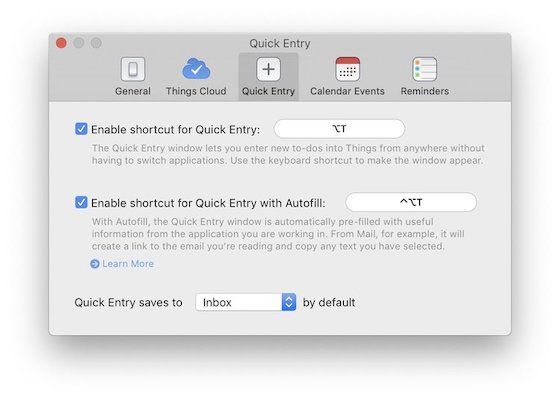
The best part is that Things 3 automatically captures the link of the webpage or email you are on, so you can just click on the link if you want to go back to the webpage or email you were on. You can even use this feature to create a link to files. For example, say, I need to review a PDF document. I will just select the PDF document, hit my magic keyboard combo, and Things 3 will create a link to that document in a new task. It doesn’t even have to be a document, it can be any file type or even a folder. Finally, even if you move that folder or file around, Things 3 will be able to open that file or folder as long as it is present on your Mac. This is something very powerful and I love this feature to death.
Inputting Tasks on iPhone
If you thought inputting tasks on Mac was easy, wait till you use the app on your iOS devices. Things 3 has introduced what the company calls a “Magic Plus” button which is a Plus button with superpowers. On the homepage of the app, you can tap on the button to reveal the options to create either a project, an area or a new to-do in Inbox. But, where is the magic in that, you ask? Well, you don’t have to tap the button, you can just drag and drop to drop the button on Inbox to create a new to-do in Inbox or drop underneath an area to create a project.
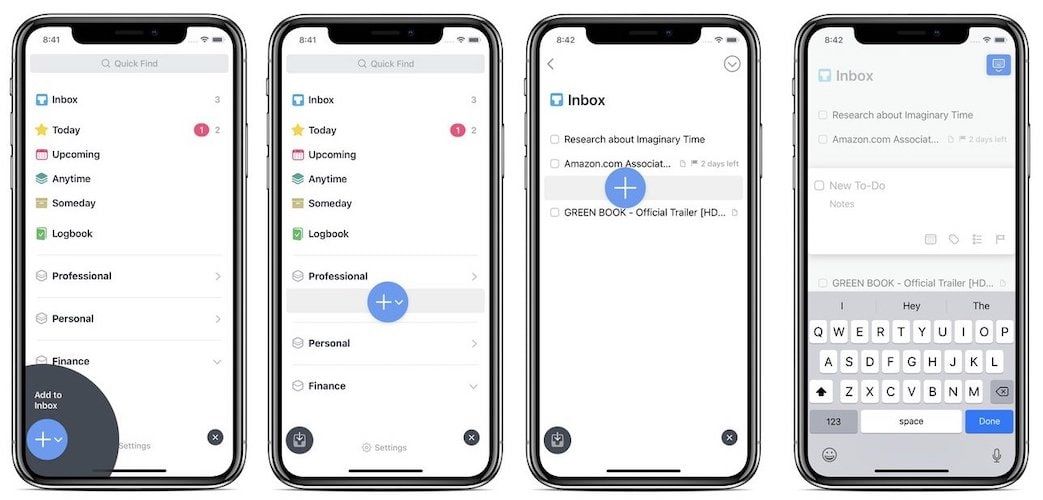
The Magic Plus button comes in really handy when you are using it inside a project to create new to-dos or tasks. Instead of tapping on the button which creates a task at the top, you can just drag and drop the button to insert a new task anywhere that you want to. You can even create new sub-headings by dragging the button to the left-most edge of your iPhone or iPad’s screen. I can’t explain how fluid the entire process feels. I am already used to gestures on my iPhone X and having an app which works entirely on gestures make it feel more native. The magic plus button is an ingenious idea from Things 3 developers and the more you use it the more you appreciate the beauty of it.
Things 3 - The Organization Structure
We have already talked a little about the organizational structure of Things 3 but I want to talk about it a little more as it is one of the more controversial features of Things 3. Things 3 has three major hierarchical structures; Areas, Projects, and individual tasks. Inbox is a separate entity as it is a dumping ground of your ideas so I never use that to organize my thoughts. Every time a new task or idea comes, it goes straight to Inbox, where I later sort it out into different projects.
As you might have guessed by now, A project is where structured to-dos live. For example, I can create a project for shopping and put all my shopping items there. Now all that we are left with is Area which is basically a place where you can house similar projects. I have created three main areas; Work, Home, and Finance. So, every new project or task related to work go inside the work area, and so on.
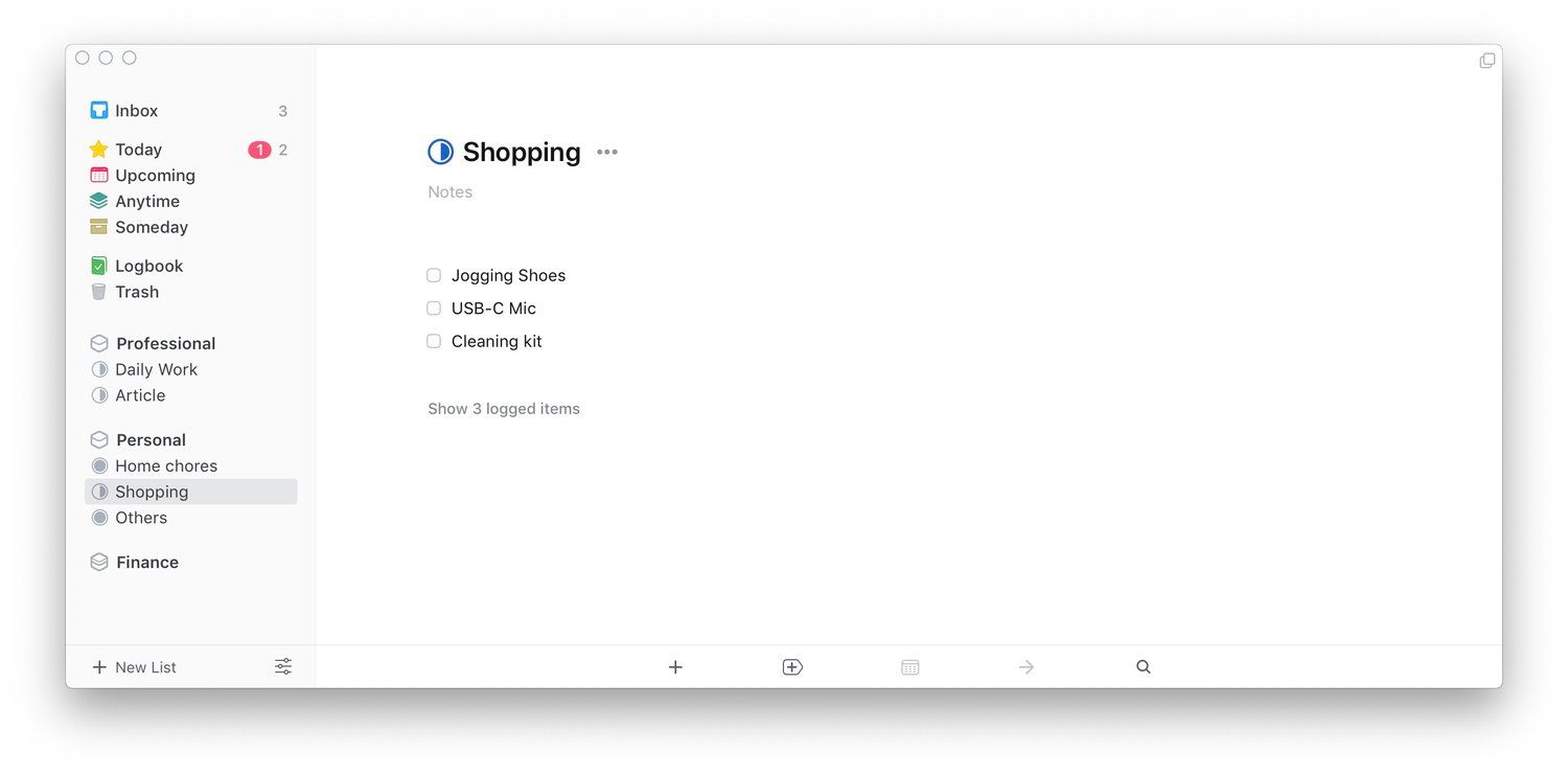
There are a few other things worth mentioning. Every task can house a checklist inside it. This is nice as it helps in giving context to a task. For example, if I am traveling, I can have a task called “book tickets” and then add the sub-tasks such as dates of travel to different places in the check-list. Things 3 also allows users to create sub-headings inside a project. Sub-headings are nice as they allow us to organize tasks in a more neatly fashion, however, they also feel like a lost opportunity. They don’t have notes integration, they can’t have individual deadlines, and they don’t even show up in your today view. That feels a little short-sighted to me as sub-headings can be made more powerful and useful.
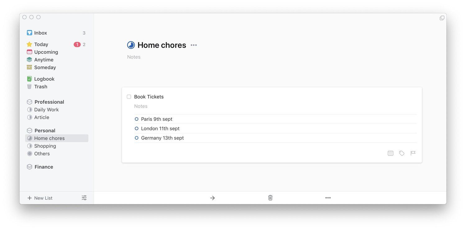
And this approach defines the controversy around Things 3’s organization approach. While Things 3 will be enough for most of the users out there and that includes me, it’s organizational structure is not meant to manage large-scale projects. There is no way to nest projects inside other projects which certainly limits the hierarchical structure that you can create. The problem can be solved by giving more power to the sub-heading feature and allowing them to work as sub-projects instead. However, until that happens, I can visualize a certain set of users who will not be happy with Things 3 organizational prowess.
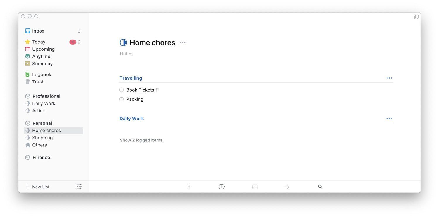
However, I would like to argue for Things 3 a little here. Nobody can make an app which will have all the features and still remain easy to use. There are apps which let you manage projects with thousands of tasks, however, you and I are never going to use them as they are too complex. Instead, Things 3 brings a design and approach which will fit the needs of most users and only people with an unlimited number of tasks will find this app lacking in features. I offer myself as an example here. I manage a full-time job, this website, and my personal life and Things 3 is yet to let me down. I find Things 3 to be more than capable of handling all my needs and I don’t even use all its features regularly.
Things 3 - Dates and Deadlines
One of my favorite features of Things 3 is the way it handles dates. You have two dates options. The first is the normal date assigning capability where you can assign dates to any task by clicking or tapping on the calendar icon. Here, you can either select a specific date in the future or mark a task for today or this evening. This Evening is a very nifty option as it helps to differentiate between the tasks that I need to get done in the working hours and the ones that I want to get done after.
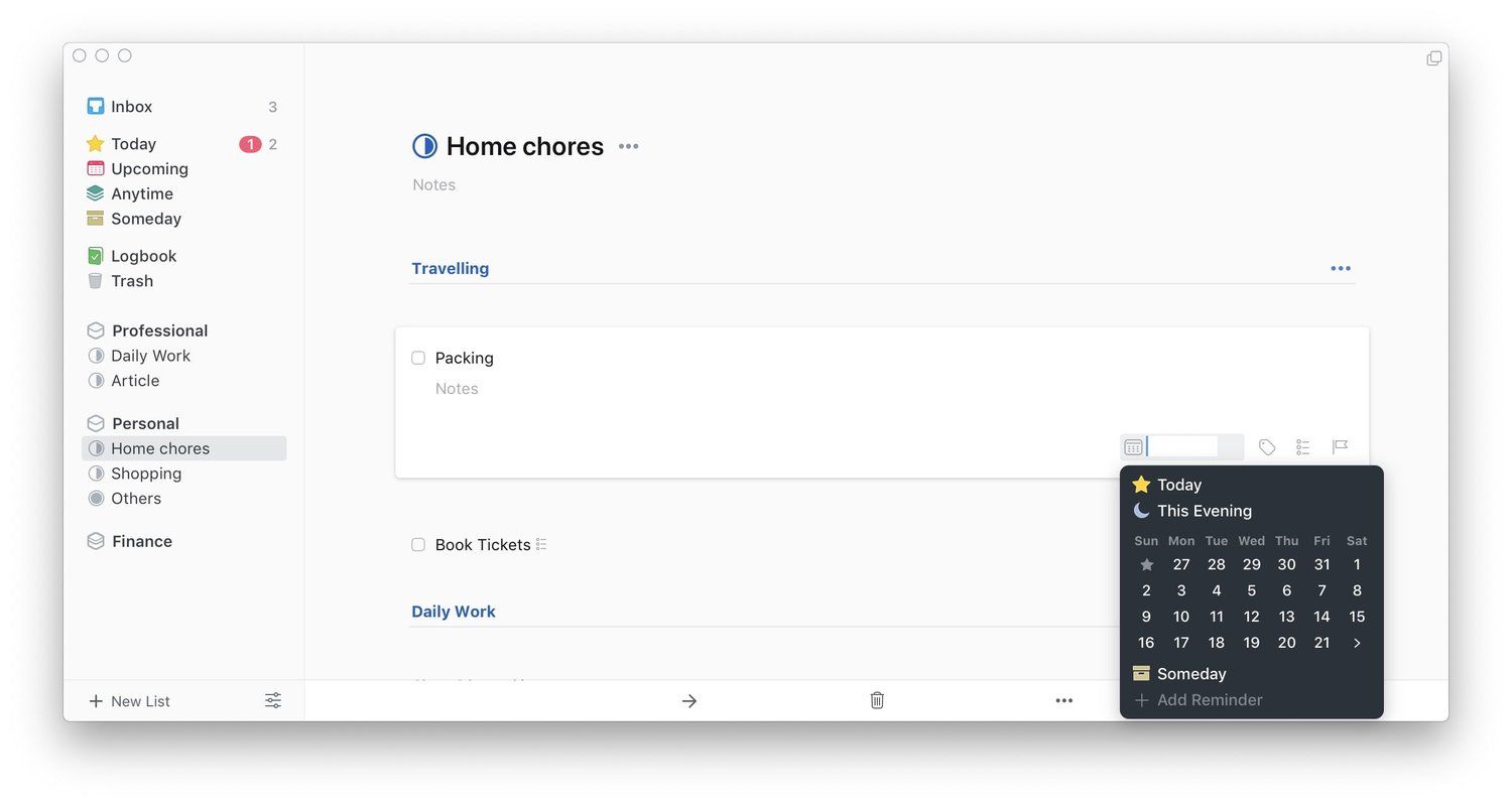
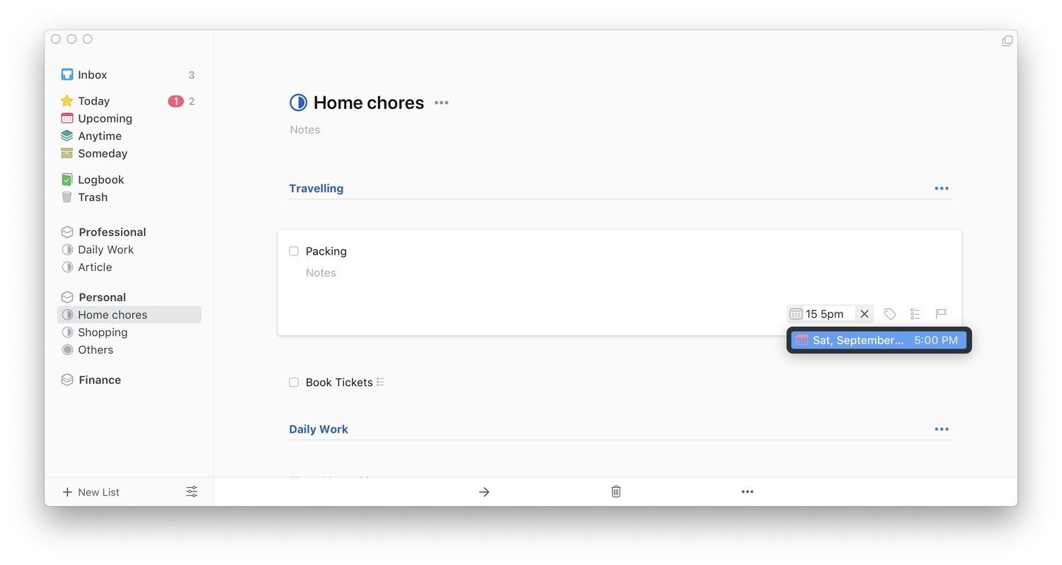
I don’t know how handy this feature will be to you but it’s one of the most used features for me. Another great thing about the calendar button is that you can use natural language processing to set your dates. Coming from Fantastical 2 which is the calendar app of my choice, I really appreciate this feature. The second type of date that you can set is the deadline which you can use by clicking on the flag icon.

Deadlines differ from your normal dates in one specific way. The tasks that have been marked with deadlines show a flag next to them along with the number of days left to complete those tasks. Also, on the day of the deadline when a flagged task appears in the today view, it get its own separate red badge. I use the deadline features only for those tasks which are really important. Overall, I just love how easy Things 3 makes assigning dates to your tasks.
Things 3 - Different Viewing Options
So by now you have input all your tasks, organized them into different projects and areas and assign dates and deadlines, now what? Well, now Things 3 will use its magic to show you the best way to deal with your tasks. Let us start with my favorite and the most used view called “Today”. As its name suggests, the Today view you shows you all the tasks that are due today.
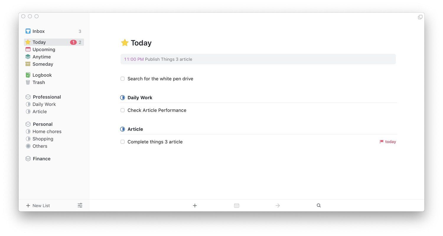
Apart from the tasks that have been marked as Today or This evening, this field is also populated with other tasks whose due date is today. This is great as it shows you all your due tasks at a glance.Below the Today view is the Upcoming view which shows you a forecast of all your tasks. This view is helpful if you want to see how your future week looks. Both today and upcoming view also show your calendar events by default.
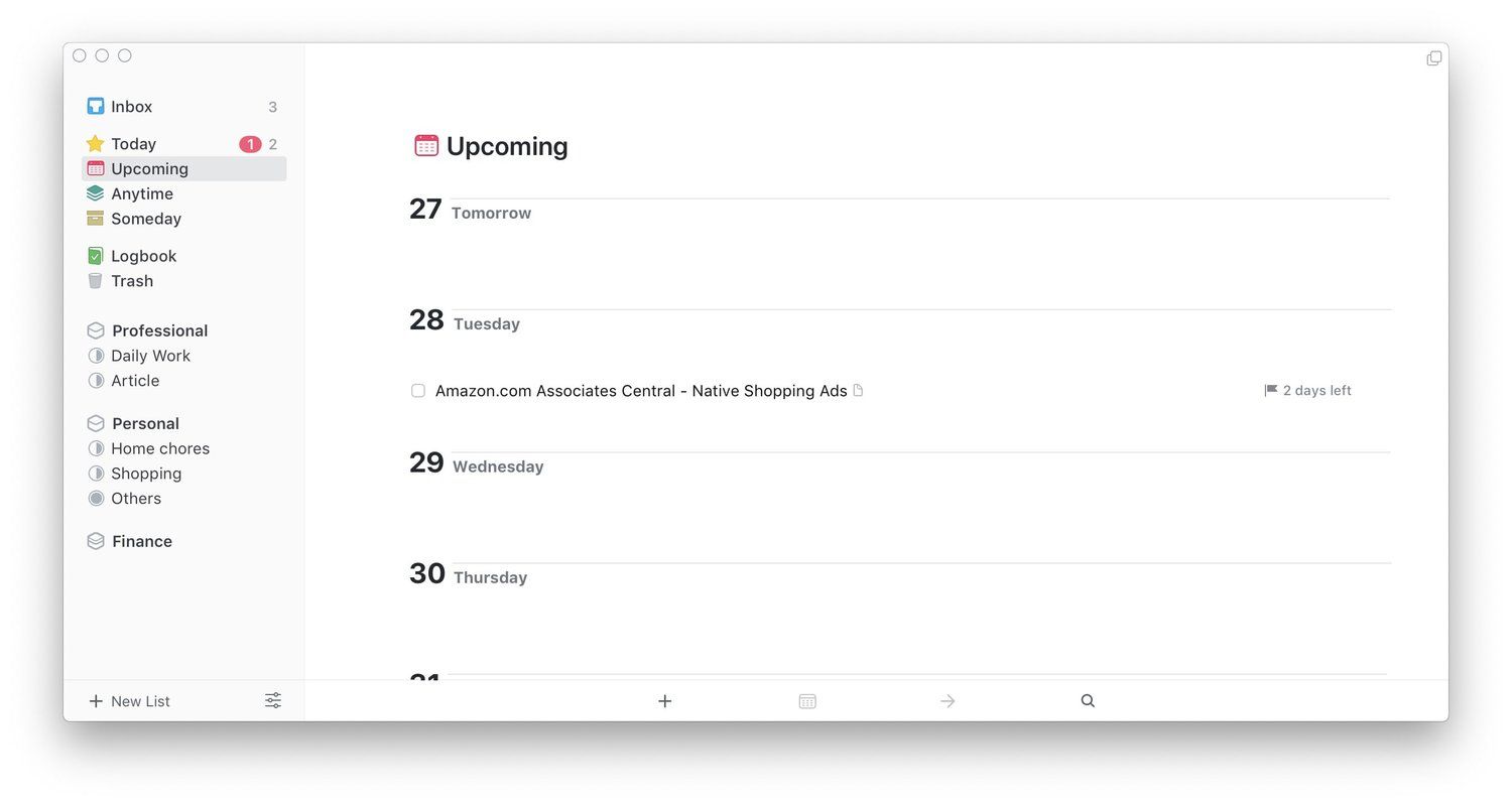
You can turn it off by going into the app’s preferences. I keep it on as I find it quite useful as I get a holistic sense of all my due tasks and events which helps me tackle those tasks in the most efficient manner.
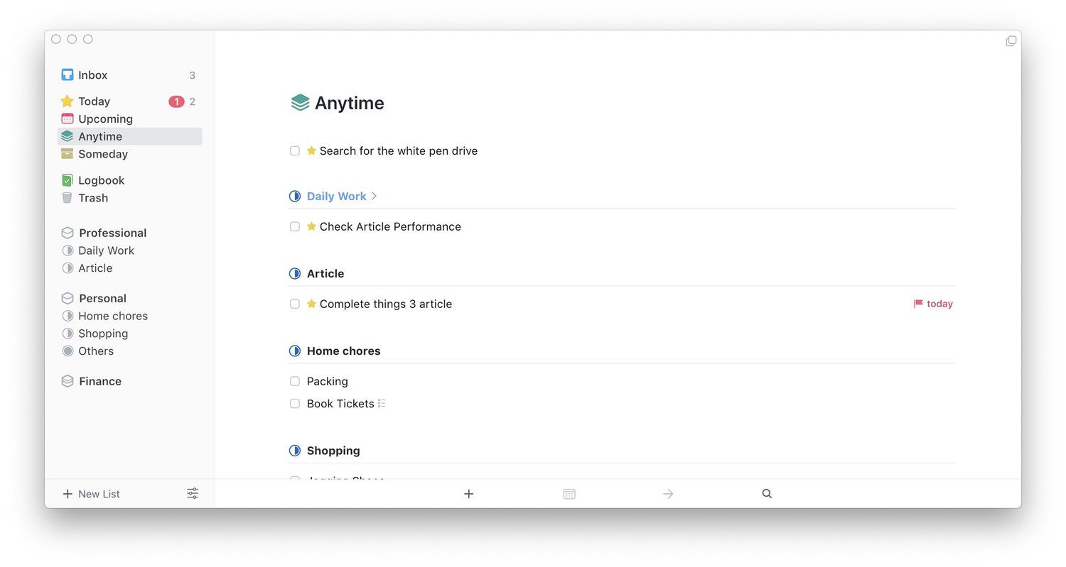
Finally, there’s Anytime and Someday view which I have already explained so I won’t go to into much details here. With its different viewing options, Things 3 makes it really easy to tackle your tasks and they are one of its biggest strengths.
Things 3 - Tags
I must admit that I don’t use tags that much and so I have never explored its usefulness and shortcomings to its fullest extent. However, after doing a little research, I found that Tags are a little hit and miss in Things 3. On one hand, you can create and attach multiple tags, while on the other, tag nesting and searching don’t work as it should. For example, you cannot search for a tag in iOS devices. While searching for tags works in Mac, there is no substring matching which means you will have to remember the starting letters.
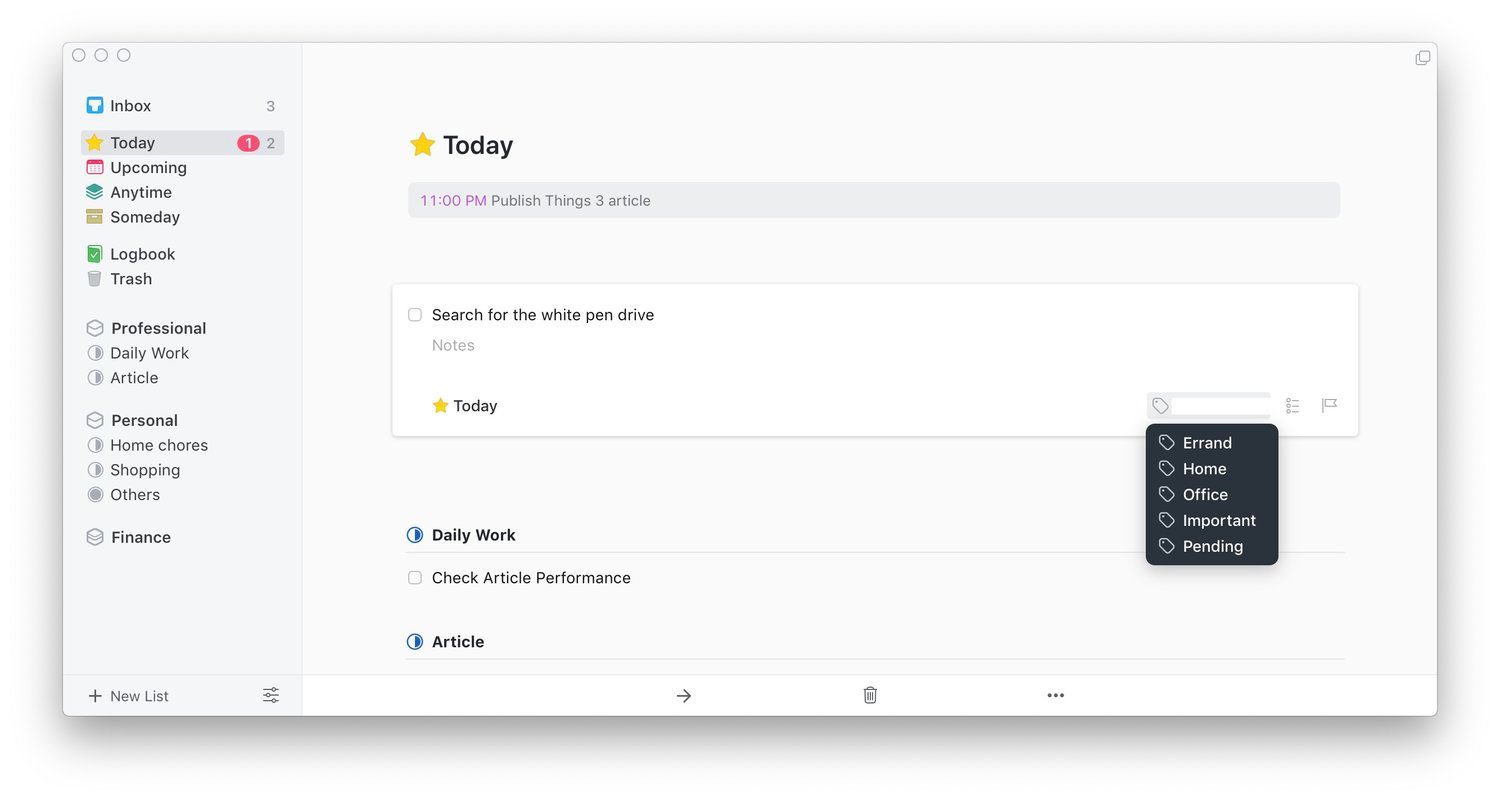
More problems emerge when you start using tag nesting. For once, using a children tag doesn’t auto-applies the parent tag. Thankfully, searching for a parent tag brings up all the task with children tags. That said, for 90% of users, I don’t this would be a problem as primarily tags work as they are supposed to. They are there to provide a little context and allow users to see tasks across projects. I mainly use tags for these purposes and I am quite happy how tags work. However, if you lie in that 10% who live and die by tags, you will find it a little difficult here.
Things 3 - Notes and Documentation
One of the biggest strengths of Things 3 is how the app handles notes and documentation. This is the feature where most of the other to-do list apps for Mac and iPhone falter in a big way. Of all the apps that I have tested, Things 3 is the only app that documentation right. Firstly, every task has a notes field which can house texts, web-links, and file attachments. That basically means that you can store all the information that you need to complete that task right below the task itself.
It makes it very easy to handle tasks without looking for the related information in other apps. I also love the fact that every project that you create has a notes field up at the top where you can save all the relevant information related to that project. Things 3 never hides information for you rather it allows you to store everything that you need to get the job done in the right place.
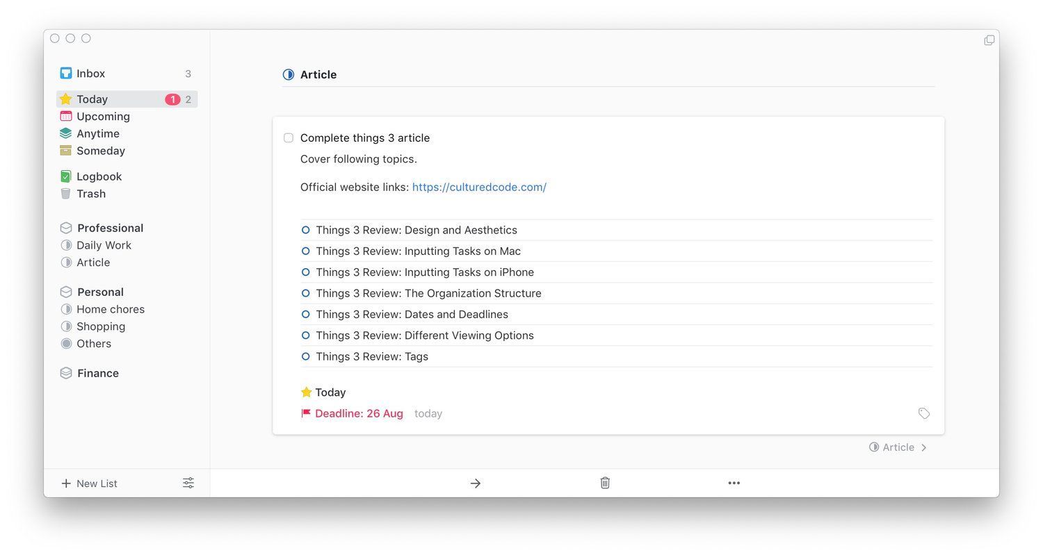
There is one problem here though. While all your text and link-based notes are synced across devices, the attachments do not. This is because attachments are not saved as files rather as links to the files on your system. I love the fact that even if you move the file around, as long as it is present on your system, it will open by clicking on the link.
However, that link also means that there is no way the files will sync across devices. I do hope that this problem is resolved sooner rather than later. Maybe they can use iCloud integration to sync attachments that are stored in iCloud or something like that. That said, apart from this snag, Things 3 is perfect for keeping notes and documentation and is certainly miles ahead of its competition.
Things 3 Review: Shortcomings
Update: With the release of Things 3.8, Dark mode is now available for iOS devices too.
While I love Things 3 and recommend this app to anyone looking for a good task manager app for iPhone and Mac, it doesn’t mean that the app is flawless. Just like every other app, Things 3 has its own shortcomings. Firstly, there is no dark mode. This is the feature that I am highly anticipating and I hope it comes soon. Secondly, Things 3 doesn’t get the nested project and nested tags right.
While the former doesn’t exist, the latter doesn’t work as it should. Another missing feature that might turn some people off is sharing. There is simply no way to share your tasks with others. I also hate that I cannot see all the tasks inside an Area at one go. I have to open individual projects to see tasks. While Things 3 is my favorite to-do list app, there are a lot of avenues for improvements here.
Install: Things 3 - Mac ($49.99), iPhone ($9.99), iPad ($19.99)
Things 3 Review: Final Thoughts
Finally, the article comes to an end and I hope that I have explained everything Things 3 has to offer you and why I consider it to be the best to-do list app for iPhone and Mac. I love Things 3’s design and aesthetics, its free-flowing form, its documentation features, how easy it makes to input the tasks, how it displays pending tasks, and how easy it syncs between devices.
Of course, there are some shortcomings including nested tags, no sharing abilities, and more. However, it’s pros far outweigh the cons for me. If you are looking for a good looking and powerful task manager app for iPhone and Mac, I recommend Things 3 with all my professional and personal experience.
