Castro 3 Review: Inbox, Queue, Chapters, Dark Mode, and More
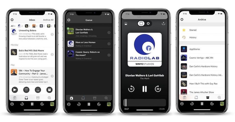
Castro has always been one of my favorite podcast player apps. I love its approach of handling new episode releases which it does by using a combination of inbox and queue. It is also by far the best designed podcast player on the App Store. The animations are fluid and look beautiful and everything is where it is supposed to be. Today we are talking about this app as Supertop, who are the developers behind Castro, have released a new version of the podcast player; the Castro 3. With this new release, apart from bringing a ton of new features, Castro also joins the likes of Ulysses and Drafts 5 as it has adopted the subscription pricing model. That said, believe it or not, it’s a good thing. In this article, I am going to do a full review of Castro 3 and tell you why the new subscription pricing model is actually good for Castro users:
Castro 3 Review: The Beginnings
As mentioned above, Castro 3 is a podcast player app which can help you subscribe to your favorite podcasts and listen to them either by streaming or downloading them using the player. Since the release of the first version of Castro, the app differentiated itself from myriads of other podcasting apps on the App Store by bringing a different approach to how the app handles subscription and new episode releases. I personally have been using this app since 2017 and the thing that I most love about this app is that the app is fast to implement new features.
With the release of iOS 11 and iPhone X, Castro 2 became one of the first apps to support the notch and brought drag and drop support. I mean, I never knew I needed drag and drop inside a podcasting app until I used it on Castro 2. For all these reasons and more, I have been using Castro as the medium to consume all my podcasts for more than over an year.
Why We Needed a New Approach to Handle Podcast Subscriptions
A few years back podcasting used to be a niche genre and only selective people were really passionate about it. However, Serial, a podcast by WBEZ Chicago and This American Life, changed all that. The popularity of the first season of Serial threw the podcasting world into limelight. As the podcasting world started seeing a huge increment in the number of podcast listeners, a number of new series started to pop up. The latest numbers are in and you won’t believe them.
As of April 2018, there are 525,000 active shows with over 18.5 million episodes. Needless to say, there’s a lot of content to be consumed out there. The number of great podcasts that are available to listen has increased ten folds if not by hundred. It means that people now subscribe to more podcasts than ever before. I know I do, and if you do too, you know that the standard podcast management solutions find in the apps like Pocket Casts (still my favorite cross-platform podcast player app) and Overcast don’t cut it anymore.

Both Pocket Casts and Overcast along with all the other myriad of podcasting apps out there use a very simple way to organize your podcasts. Everything that you subscribe to live inside a subscribed tab. Here, you can either set the new episodes to download automatically or you can choose to download episodes manually. Both these options are not feasible as neither I want to download every episode nor I want to individually open each subscription to see which episodes are new and whether I want to listen to them or not. You could set up filters to make things easier for you but they are hard to figure out and don’t work as seamlessly as you want them to.
Castro’s Brand New Approach
While all the new podcasting apps were copying the same approach, Castro did something different and that made me fall in love with this app. When you launch the app you will see that Castro uses four different tabs to help organize your podcasts. From left to right, they are Queue, Inbox, Archive, and Discover. Discover tab is the place where you discover and subscribe to podcasts, and it's also the weakest point of Castro. Castro's discover section only works if you know what kind of podcasts you are looking for.
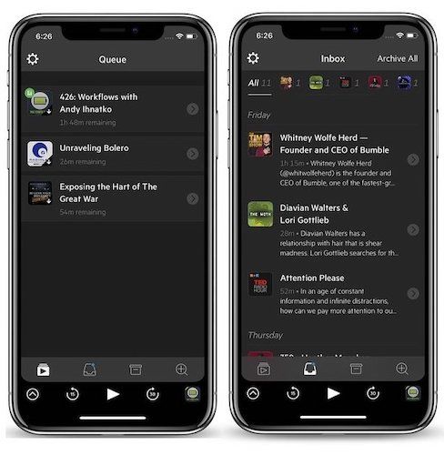
I hope that the service will improve its Discover section in future updates. That said, once you subscribe to podcasts, everything nicely falls into its place. Instead of treating new episodes as subscriptions, Castro treats them as emails. What that means is that every new episode gets deposited into your Inbox which is the second tab from the left.The Inbox gives you a precise view of what episodes are new and from here you can decide if you want to listen to those episodes or not.
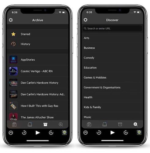
If you do want to listen to them, these episodes are forwarded to your Queue. If you want to skip episodes, you can archive them which can be then later be found inside the Archive tab. The Archive tab houses all your subscribed podcasts and it’s from here that you can go back and listen to the past episodes. I really love this approach as I don’t have to remember to see which episodes have been released. I know that each new episode will be directly deposited in my Inbox and I can parse them from there.
Castro 3 Review: From Inbox to Queue and Archive
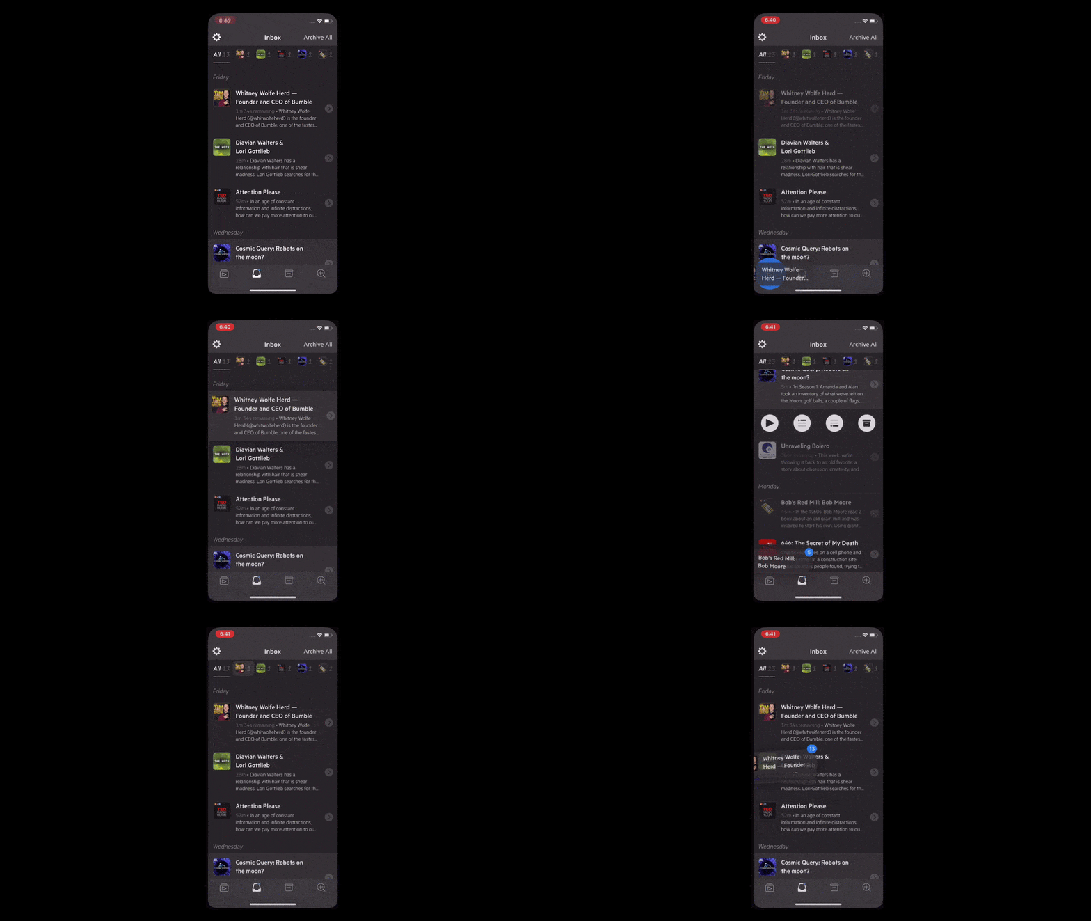
Castro makes it easy to either archive or send episodes to your listening Queue. There are a couple of ways to do that. First, you can tap on an episode to reveal four action buttons. The first is the play button which will instantly start playing that episode and put it at the top of the Queue. The second and third buttons are the Queue buttons which put your episode at the top and the bottom of the Queue respectively. The last is the Archive button which archives the episode if you don’t want to listen to it.
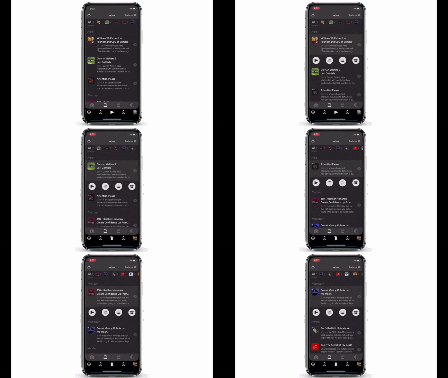
If you don’t want to use the buttons, you can also use Castro's drag and drop functionality to parse through the episodes. You can tap and hold on an episode and drag it to either the Queue or the Archive tab depending on what you want to do with that episode. You can even select multiple episodes by first dragging one episode and then tapping on others. Another way to use drag and drop is by dragging the podcast icons at the top of the Inbox tab.
Castro 3 Review: The Queue
Now that you have added episodes to the Queue, you can rearrange their playing order by simply dragging and dropping the episodes above and below other episodes to rearrange them. You can also tap on an episode to find other options including the ability to play the episode, archive it, or Star it. Starred episodes are like your favorite episodes. You can star an episode if you loved it and you know that you might want to listen to it again.
Archive, Favorite, and History
We have already seen the main way Castro handles new episodes and releases, however, there are other little things that you should know which will further enhance your Castro experience. The first is the Archive tab. Here, as I told you, you can find the list of all the podcasts that you have subscribed to. You can tap on a podcast to see all the past episodes and easily add any past episode to your listening queue.
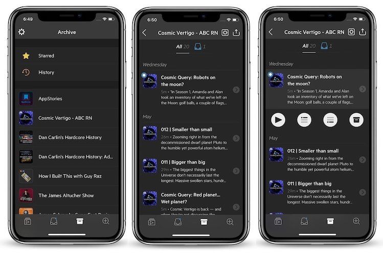
One of my favorite features of Castro lives inside the Archive tab and that’s the History. The History lists all the episodes that you have listened to in the past in a chronological order. This makes it really easy to find episodes that I have already listened to and might want to listen again. Of course, you can use the stars to mark your favorite episode, but I am very selective with its usage as I don’t want to overcrowd it. That’s why my listening History is important to me. By the way, you can also see your starred episode from here.
Castro 3 Review: What’s New
Till now all the features that we have talked about were present in the Castro 2. Now, we are going to discuss all the important new features that Castro 3 has added on top of these features.
1. Trim Silence
One of the biggest missing features in Castro 2 was the ability to trim silences. Of course, you can use variable speed to cut down the time it requires to go through an episode, but the ability to remove silence lets you do it without hampering your podcast listening experience. The ability to trim silence allows you to enjoy the podcast in a way it was intended to while reducing the time by trimming unnecessary silences.
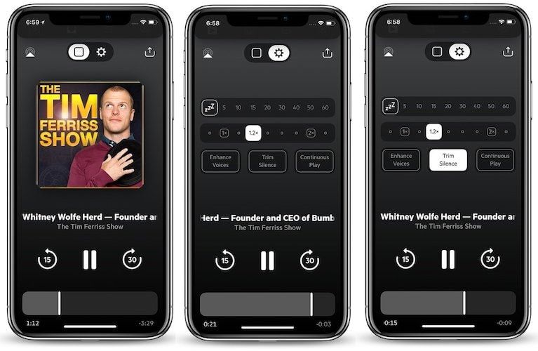
This is the feature or lack thereof it, which had stopped many users from using Castro over other apps like Overcast in the past. However, now it’s here and it works really well. I tested this feature on a couple of different podcasts and not once I felt that it hampered my listening experience. If you listen to a ton of podcast, this feature will save you a lot of time without you even realizing it.
2. Chapter Support
Another missing feature of Castro 2 which Castor 3 is bringing to the table is the support for chapters. I love this feature as it tells me what listening experience I am in for by giving me the overview of the podcasts. Chapters give me a guide to what exactly the hosts are going to talk about in the episode and then allow me to easily skip the parts that I am not interested in.

You can access the chapters by tapping on the title ticker present on the player screen. Once you tap on it, you will see all the chapters in chronological order. The app also shows the running length of each chapter along with the remaining listening time of the chapter that you are already listening to. You can tap on a chapter to skip directly to it, and yes, the app also supports chapter specific artwork now.
3. Per-Podcast Settings
Castro 3 introduces one very interesting feature that is hidden inside the settings page of the Castro app. The settings page can be accessed by tapping on the cog icon in the top left corner of the app. Once you open it, apart from other useful settings, you will see an option of “Per-Podcast” Settings. Here, you can set default settings for individual podcasts. For example, you can set the default playback speed, episode limits, and more. That said, I use this feature to make my favorite podcasts skip the Inbox and directly get added to my Queue.
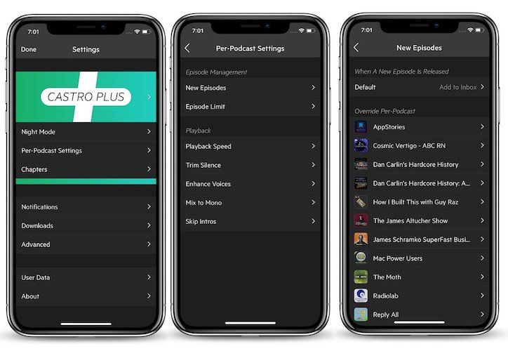
For example, I love the “Reply All” podcast and I know I am going to listen to each and every episode of it. So, as per my preferences in the Per-Podcast Settings, every new Reply All episode is directly added to the top of my Queue and never appears inside my Inbox. That’s a very good way to directly add podcast episodes to Queue which you know you are not going to skip.
4. Redesigned Player Screen
One of the biggest cosmetic changes coming with the Castro 3 is the redesigned player screen which looks much more organized and clean despite harboring even more options. The default player screen only shows you the podcast artwork and the title ticker, however, swipe over and you will see the control screen which hosts a number of control options. From here, you can set the sleep timer, change the playback speed, and access other options such as the Enhance Voices, Trim Silence, and Continuous Play. The rest of the options including the play/pause button, the ability to go forward and backward, AirPlay and share are constant for both the screens.
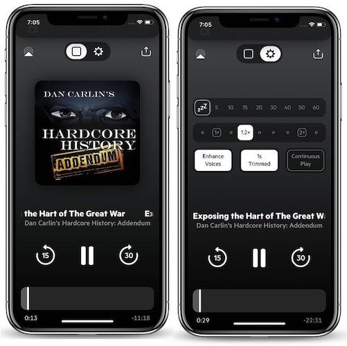
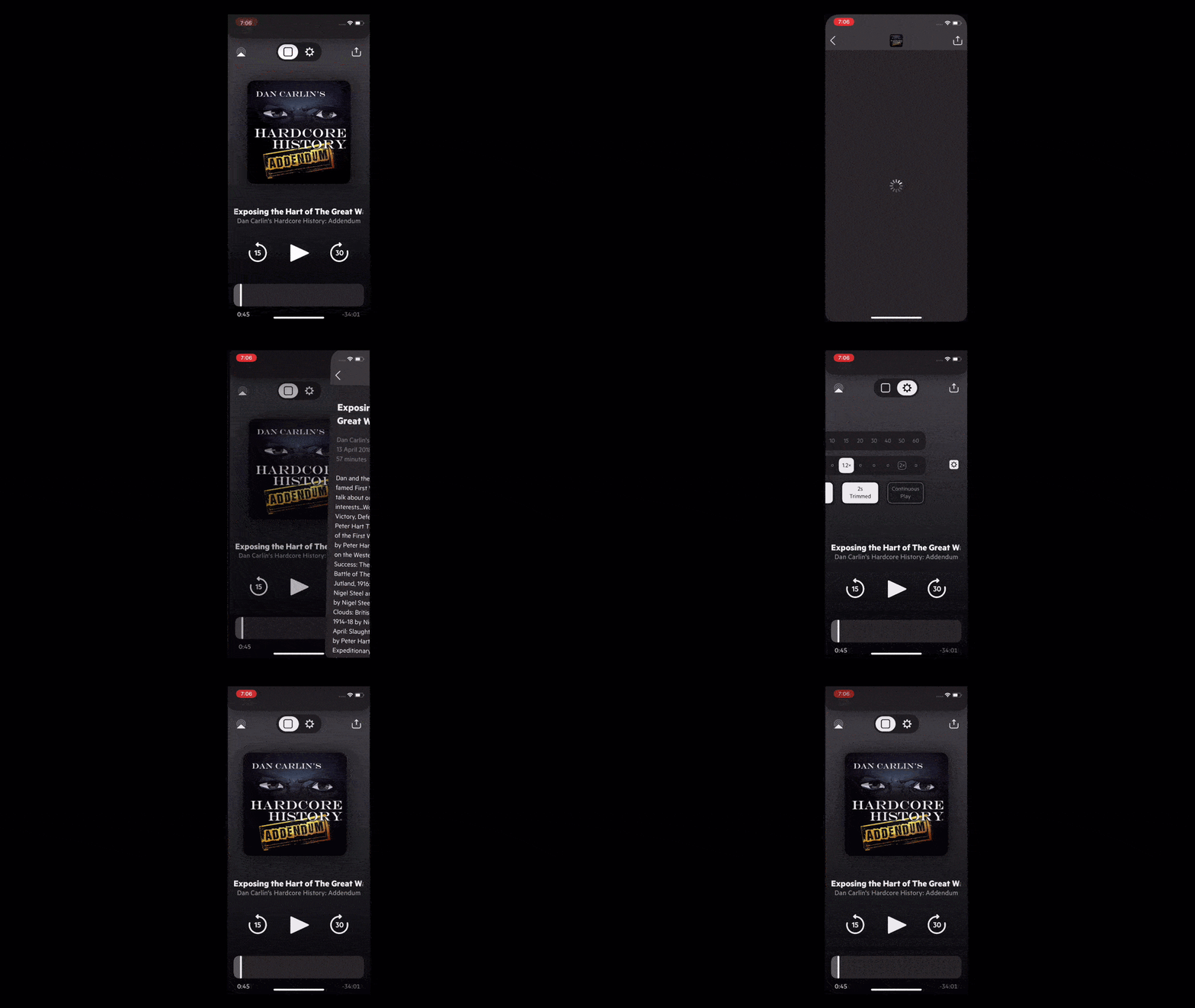
Apart from these clearly visible settings, there are also a couple of hidden options which you can access by swiping and holding to the left and right of the two views that we just talked about. Swiping and holding on the left of the artwork screen will open the episode’s show notes while doing the same on the right of the second screen will open the Per-Podcast Settings page. Lastly, you can also double tap to star episodes just like you do it on Instagram.
Castro 3 - New Subscription Pricing with Castro Plus
As I mentioned in the introduction, Castro has switched to a subscription pricing model with the new Castro 3 update. While the previous Castro 2 used to cost $4.99 for onetime purchase, the new Castro 3 app is free to download and costs $2.99/quarter or $8.99/year for the Castro Plus subscription. With the Castro Plus mode you are getting all the new features that are being released with the Castro 3 along with some Castro 2 features. The features include Trim Silence, Per-Podcast Settings, Mix to Mono, Enhance Voices, and Dark Mode. Whatever plan you choose, there’s a free 7-day trial available for you to check out.
Why Switch to Subscription Pricing Might be Better
I believe that Castro’s switch to subscription-based pricing with the new Castro 3 update is ultimately better for users. Firstly, if you have already purchased Castro 2 before, the app will still be functioning and you can even enjoy it for as long as you want. Even the features like the dark mode and enhance voices which are now part of the paid subscription but were introduced with Castro 2 will remain available to Castro 2 users for free. So, there’s no way a Castro 2 user can complain as not only they are not losing anything but they are also gaining all the performance benefits that are coming with the new Castro 3 without any charge.
As far as new users are concerned, now Castro 3 is free for them to download and use and they don’t have to pay a dime if they don’t want to. Castro 3 is packed with features even for its free version and if you are not someone who essentially needs all the pro features, you can happily use this app for free. So, I don’t think there is one user out there who will be unhappy with this move to a subscription pricing model. Yes, there always be the pain of keeping track of all these subscriptions, however, since Apple has been promoting subscription pricing model like crazy, I doubt that this will be the last app to do so and I would take a smoother transition over haphazard implementation any day.
Install: Castro 3
Castro 3 Review: Final Thoughts
Castro 3 is a very good podcast player app. It brings a new approach to tackling new episodes using an email-like inbox system which has been very effective for me. However, I do agree that this app is not for everyone and people might find it hard to change their habits if they have never used this app before. That said, I highly recommend Castro 3 to anyone who listens to podcast a lot as it will make their podcasting journey much more fun and easier. And, since this app is now essentially free to download and use, you can take it out for a spin to see if it meets your needs or not.


Comments ()